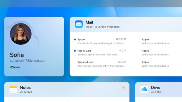
Apple launched a totally new iCloud.com design on Wednesday.
The iCloud.com site is useful if you want to quickly access some of the apps or services that are otherwise on your Mac, iPhone or iPad, particularly if you’re on a computer you don’t own or are using a PC.
When you’re on iCloud.com, you’ll now see widgets with a tile for different apps such as Photos, iCloud Drive, Notes and Reminders. It replaces the old, stale-looking iCloud homepage where there were just icons for those apps. So, for example, now you can see recent photos you snapped, the latest emails in your Mail inbox, the latest files you’ve opened in Drive and new Notes you’ve written.
iCloud.com gets redesigned.
Sofia Pitt
You can also customize the homepage however you like, placing certain items, such as your email or photo gallery, in specific places.
There’s a plus sign on the top upper right side of the screen that you can tap to create a new email, note, calendar event and reminder. Or you can tap it to create a new Pages, Numbers or Keynote document.
There’s also a menu option where you can manage iCloud+ features such as Hide My Email, iCloud Private Relay and HomeKit Secure Video.
The bottom of the page shows details about your iCloud storage plan, such as how much storage you’re using. There’s also a data recovery option where you can restore deleted files, bookmarks, contacts and calendars.


